
It's finally happened...
Nintendo has announced a proper no-gimmicks remake of the legendary The Legend of Zelda: Ocarina of Time.
But there's a problem. Many problems, to be more accurate. With this article I'm making it my objective to clearly state what those problems are. At least, based on what we have seen so far. More issues may yet arise as we learn more about the game.
Before we dig in, I need to address the elephant in the room: the aesthetic of the remake.
Let me start by saying there's absolutely nothing inherently wrong with how the characters look. The appearance of the characters in the remake varies widely compared to the more consistent original style, especially in terms of how their faces are designed. But this isn't inherently a problem - people look different and exaggerating those differences can make for good character design. I think many of the new designs show this off well, and represent the character well without losing touch with the original design. Ganondorf, Saria, Impa, Ruto, these are examples of the best redesigns the game has to offer and they do look great. If the entire package was up to the standard of these four, I wouldn't be writing this article.
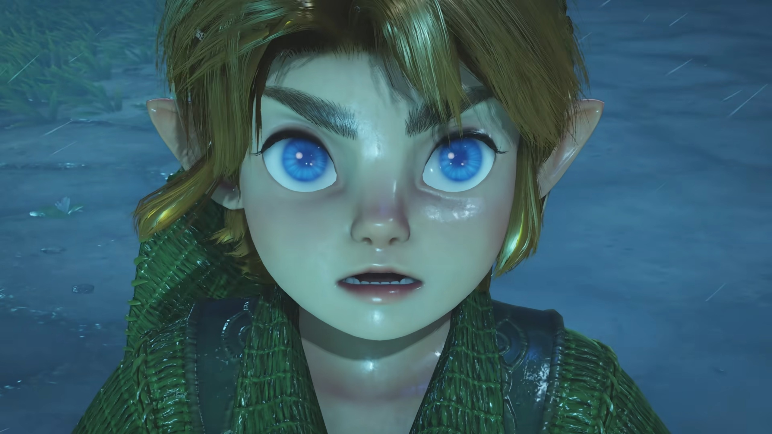
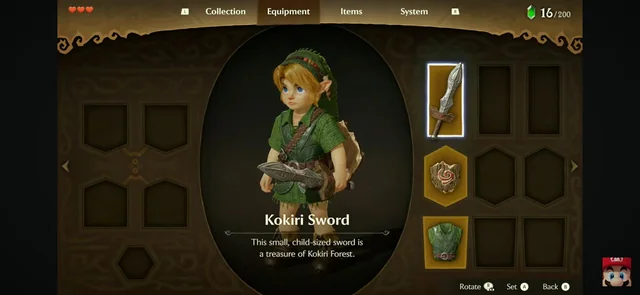
The problem is the other... less fortunate characters. Young Link I believed fared the worst of all. Gone is his youthful confidence, his simple tunic, replaced with a strange moist cabbage patch reject wrapped in frog tape. The question I can't stop asking myself is why? Why so thoroughly replace such iconic designs when we finally have the graphical fidelity to really represent them properly?
Why indeed...
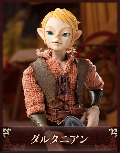
There is a theory being spread through the community that the designs for the characters, Link primarily, took inspiration from a form of Japanese puppet theater known as Ningyōgeki, literally Puppet (Ningyō) Play (geki). This theory originated from a Tweet posted by a former Nintendo employee regarding Miyamoto's love for the puppets. This was followed by other twitter users sharing an image of a Japanese puppet which does bear a striking resemblance of the overall Legend of Zelda style, especially the style of Twilight Princess and Skyward Sword. Here is that puppet:
Let me start by saying - I don't believe this theory is accurate. Here's why:
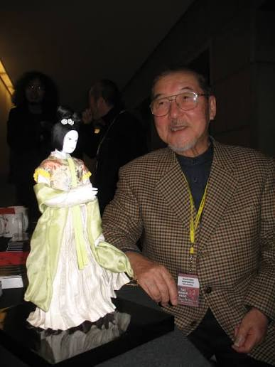
This puppet that looks Zelda-esque is not an example of the typical Ningyōgeki puppet. The typical, popular style of Ningyōgeki puppet is much closer to what you would expect from a traditional Japanese puppet, see an image below of a more traditional Ningyōgeki puppet, with its maker Kihachirō Kawamoto who created puppets for the Japanese NHK television program Puppet theater, the Three Kingdoms (Ningyō geki Sangokushi) which aired in the 1980s. Notice the term Ningyō geki right in the show's name.
In comparison to these traditional puppets, which you can find many other examples of on the internet, the Zelda-compared puppet is clearly its own distinct style. It was produced for a Japanese TV adaptation of The Three Musketeers which aired in 2009. I compared this puppet's style to Twilight Pricess, a game which came out 3 years earlier (in 2006), and I think the resemblance is striking.
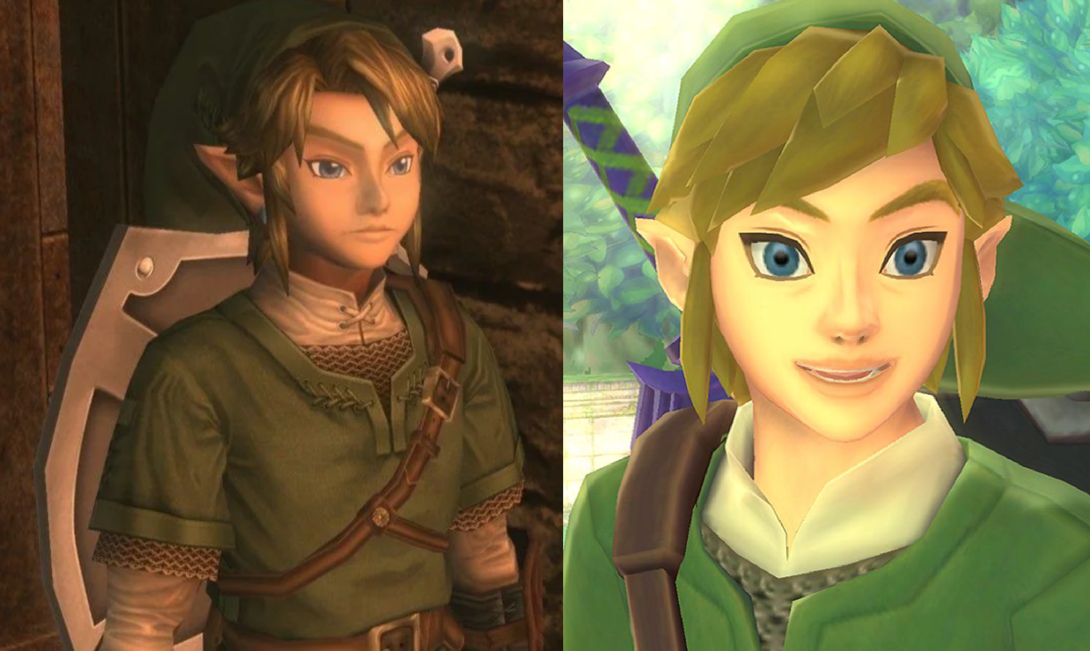
Based on this timeline, and the atypical style of the Three Musketeers puppet, it's more likely that the puppet was inspired by Zelda, not the other way around. I believe that Miyamoto's affection for Ningyōgeki did inspire the design of characers across the Zelda series, including the original Ocarina of Time - where the characters display uncanny and exaggerated features and expressions much like puppets themselves. But it's not clear if this inspiration came through into the remake. In my opinion this comparison between Link's remake appearance and the Three Muskteers puppet is a cherry picked example used to try and deflect criticism from the remake by framing its aesthetic missteps as an intentional artistic decision.
I think if this specific puppet was a real inspiration, we would see more characters in this style throughout the game. But Young Link is really the only person who looks like this. The Castle Townspeople have lower poly models more reminiscent of the original style. Characters like the four I mentioned earlier were clearly made with the intent of representing the original style. But Young Link and, to a lesser extent, Adult Link both have this uncanny puffed up realism to them. To me that feels less like an intentional artistic decision and a producer somewhere in the process pushing for "more realism" and "more detail" especially on the main character. This is a system seller after all, and the suits think photorealism is all gamers care about. But that's just speculation. Let's get back to the facts.
With that out of the way, I'm diving into more detailed complaints regarding the OoT Remake.
What's Wrong? #1 - Respect for the Original Game
By far the most frustrating aspect of the Remake: It wants me to think the original game is bad.
Throughout the remake as we've seen it and its marketing are many clear repeated assertions that the original game is bad. During the announcement, it was said that in the original players would roll often to get around quicker, so they added a run. But what's wrong with rolling to get around quicker? Why is that something that should be changed? The original movement system was not born out of necessity, the original game could have implemented a run no problem. Super Mario Bros gave Mario a run all the way back in 1981. Rolling made you go faster because it was satisfying and felt good, and players used that as a technique to move faster. This interplay between the dev team's design and the player finding a way to utilize it is the key to an engaging and interesting game experience. While playing, your natural desire is to go faster, so you find ways to make that happen. The game didn't need to give you a "go faster" button. By taking away the opportunity for the player to find their own way to go faster, the remake flattens the gameplay experience and eliminates a major part of what makes the game fun.
The remake doesn't just scream "Ocarina of Time SUCKS" it carves it into stone by gutting major systems completely. Did you notice that the remake has completely removed all of the fixed camera angles or other moments where your camera moves on its own? Ocarina of Time has some of the most exceptional camerawork in gaming, a wonderful blend of 3rd person action, fixed angles, and programmed movement, which creates a truly unique feeling across every part of the world. These are all over the original game, and they're so smooth you might not even notice them. Load up the recompile and check for yourself. My favorite one in the whole game is on the walk up to Zora's Domain, in the tight hallway right before the waterfall. Walk through this section slowly and pay attention to how the camera moves. In this small section, the camera is on a fixed track designed to create a very specific feeling and it works very well to achieve that feeling. These camera techniques are used constantly, from meeting the Deku Tree to the many angles around Castle Town to the ominous fixed camera facing the Temple of Time. These moments give incredibly strong charater to the world. Removing them is pure laziness at best and absolute malice at worst. They are not a technical limitation - they are an artistic decision. One that is highly impactful to the experience of the game. Removing these fantastic fixed camera angles is akin to painting over the Mona Lisa's smirk with a flat :^| face. Only someone who didn't understand the value of the original work could think such a change is defensible.
This leads right into my second issue:
What's Wrong #2 - Change for Change's Sake
Ocarina's aesthetic is one of the strongest in the history of gaming. It's designs and concepts are massively influental. So why on earth does the remake feel the need to completely change some of the game's most iconic designs? Link himself is the penultimate example of this. Gone is his nicely spun green cloth tunic, now he gets to wear a highly detailed garbage bag that looks like it's woven from discarded green garden hoses. The remake says, forget clean forget simple forget classic. You're getting eye-bleed inducing details jammed into every design even if it isn't adding anything. If an old design isn't scribbled all over with pointless details, it's changed outright for no clear reason. See the Hookshot/Longshot, which has been removed from the game and anachronistically replaced with the Clawshot from Twilight Princess. This decision baffles me the most. It's like deleting Navi and putting Midna in her place. Even though we all love Midna's fat ass, she doesn't belong in this game. Ocarina's designs are worthwhile, they are not dated, they are not "old", they are not mistakes or limitations that need to be upgraded. They are intentional artistic pieces that are actually quite exceptional and great examples of an aesthetic that knows what it wants and makes it happen. That's Ocarina of Time's style. Unfortunately, the remake has none of that style. In fact, it seems to despise it entirely.
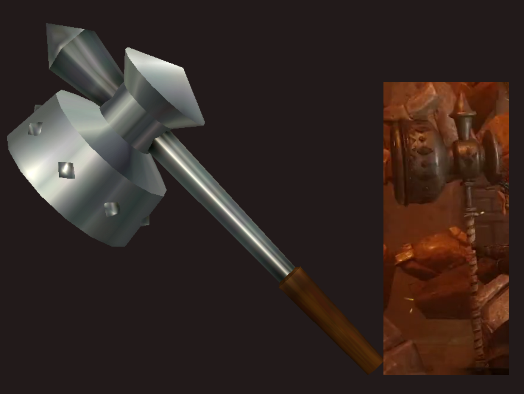
Another example of aesthetic assassination in the remake, the Megaton Hammer. It's supposed to be metal guys, this new one looks like ceramic cookware! Does that big thing cook a mean chowder or what? They also ruined the animation by making link hold it very high up on the handle, even during the swing. That's not how you hold a hammer. You swing from a high grip to get initial speed then bring your hands low to amplify the force through the swing. This is how Link swung the hammer in the original, like a real hammer. Now he swings it like, well, cookware! I think a frying pan would be more intimidating than this enameled meat grinder looking thing on the right.
Change for Change's sake is also shown clearly in the writing. Adding pointless "new dialogue" to the game, stuffing in voice acting wherever possible. Yet making no attempt to even cast actors who can portray these characters. Ganondorf's voice makes me want to puke, it's painful to hear. I'm sure his VA is talented but he's NOT Ganondorf. He has no presence as this character. Ganondorf is an evil Wizard King, towering 7ft tall or higher, absolutely jacked. Sauroman on roids with a giant sword. But his voice sounds like a dad telling his kid a scary story, and he doesn't want to sound too mean or the kid will get scared. Nintendo would prefer to hire the first guy they see even if he phones it in. With the VA also comes lip sync, and incredibly, they couldn't be bothered to re-do the lip sync for English! As shown in the trailer, the lip sync is Japanese-only, so other languages get the experience of watching a dubbed foreign film. I love foreign films myself, but those are showing real humans, not 3d models programmed to move. Can someone tell Nintendo that lip-sync is data driven and it can and should be re-done on a language-by-language basis? In a remake that's obsessed with aesthetic deception, you get the wrong mouth movements on screen the entire game. Yet I might be the only person on the entire internet complaining about this. You can load up Skyrim (2011) and get a better lip sync performance, executed by the Creation Engine, than Nintendo is displaying in their new flagship title. Lip sync they themselves insisted on adding to the remake.
The bar is in hell! It really is.
What's Wrong #3 - Menu & UI Design
Do you like ambiguous squares? No, I'm not talking about Thomas Was Alone.
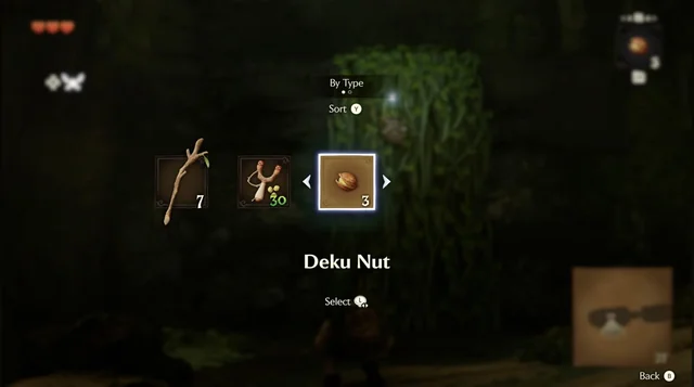
Forget how the fuck it looks for a second. Honestly. Compared to what I'm about to cover the way it looks doesn't even matter.
In the original game, your items were bound to the C buttons, which allowed you to assign 3 at once (left, down, right). In the remake, they have replaced this system with a single slot selector. You have 2 of your 3 potential items removed, replaced with this scrolling bar of squares. Ocarina of Time's gameplay is based on the idea of having multiple items out at once. Dungeons, for example, are designed around both bow and hookshot. In the original, that gives you an extra slot for a preferred item. I like to take the Megaton Hammer. In the remake, the player will be expected to open this menu constantly to easily switch between items, or have to spam the next item button to get to the one you want.
This is a complete and total downgrade from the original in terms of design and functionality. It's a vastly less effective way to allow the player to organize their items. This is another change that could only be made by someone who had no understanding of why the original game's design was effective. Not the kind of person I want directing a remake!
The same criticisms apply to the visual design of the menus.
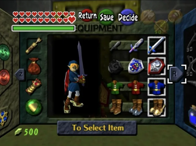
This one I think is so egregious it deserves a side-by-side comparison.
You thought that rotating 3D menu, which rendered over the gameplay in real time, was cool? How it looks like it's carved out of stone patiently chiseled to hold your gear? Too bad, it's gone! Replaced with a much more generic equip screen with some vague material and generally misguided design. Gone is Link's pose on this screen, where he would be standing ready for battle. Now you get a generic idle. Oh and it's full screen, no transparency. Less immersive, less interesting, less exciting. The three themes of this remake.
Overall I think Menu & UI are the biggest trainwrecks in the whole package. You might think remake Young Link is a cute little baby and I respect that position. But the menues are a combination of both technical and aesthetic failure I don't think anyone would consider the remake an upgrade. Nor a sidegrade. But only a complete and total downgrade. A... oh no... the dreaded word... a DEMAKE!!!
In The End...
I really wish I could be enthusiastic about this remake. I've been clamoring for this for years. A proper remake of Ocarina of Time that isn't on the 3DS. Even a single-screen port of the 3DS version would be amazing. If only this remake went into it with the same attitude as the 3DS version: fully original intent, simply enhanced graphics without redesigning things, preserving gameplay and even glitches to make long time players happy and remind everyone that yes, this really is Ocarina of Time, not some inferior substitute. Sadly that's exactly what we're getting with this remake, an inferior substitute. Maybe Nintendo will pull a Sonic Movie Design and make Link's design more faithful, and remove running, turn all the caves that used to be valleys back into valleys, put the hostile deku babas back on the way to the Deku Tree, replace all the fixed camera angles across the whole game. But they won't. This is what we're getting. And there's so many people it doesn't really matter, there's enough people who don't care or don't share my taste and it'll succeed. But there's an erosion happening. A slow creeping in the foundation we're all feeling. The alienation of the customer base, little by little. But hey, if they announce a new Smash Bros, I guess we'll all forget about it anyway. And maybe that's for the best. Right up until they reveal that Smash Link gets the shitty new remake designs and FULL VOICE ACTING on all his lines no more HYEAH, HYAA, HEEYA.
Hopefully it doesn't come to that.